MOMA X ART OF TEA | PACKAGE DESIGN CONCEPT.
The Problem
Tea packaging is typically treated as a functional container—focused on flavor labeling and shelf appeal—rather than an opportunity for deeper engagement. This approach overlooks the potential for packaging to communicate cultural value, storytelling, and experience, especially in contexts where design and art intersect.
The Solution
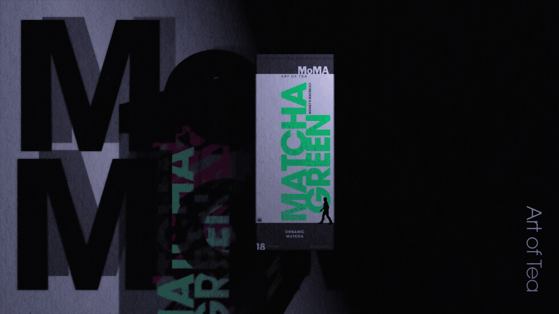
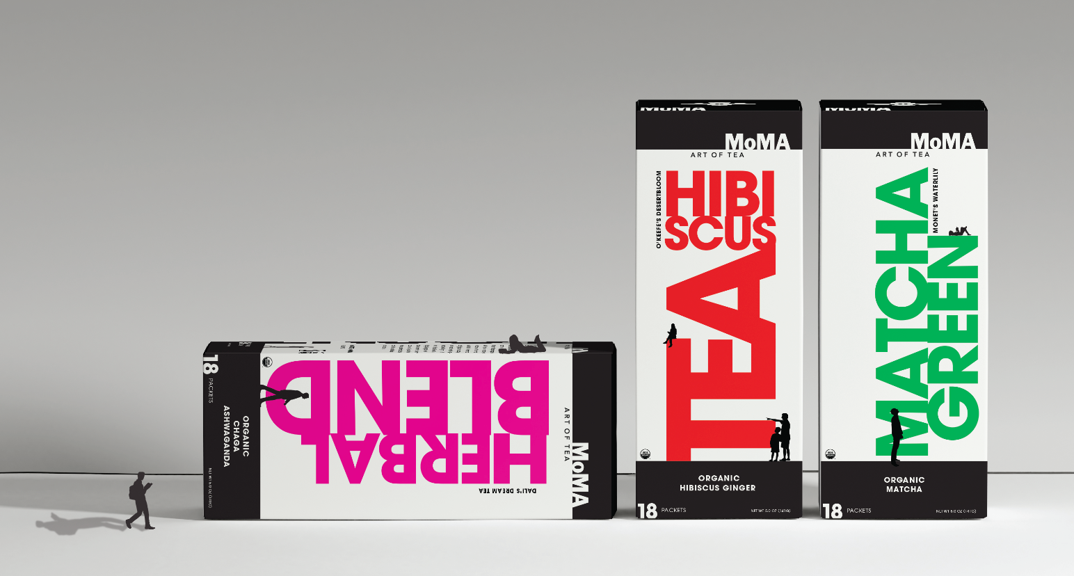
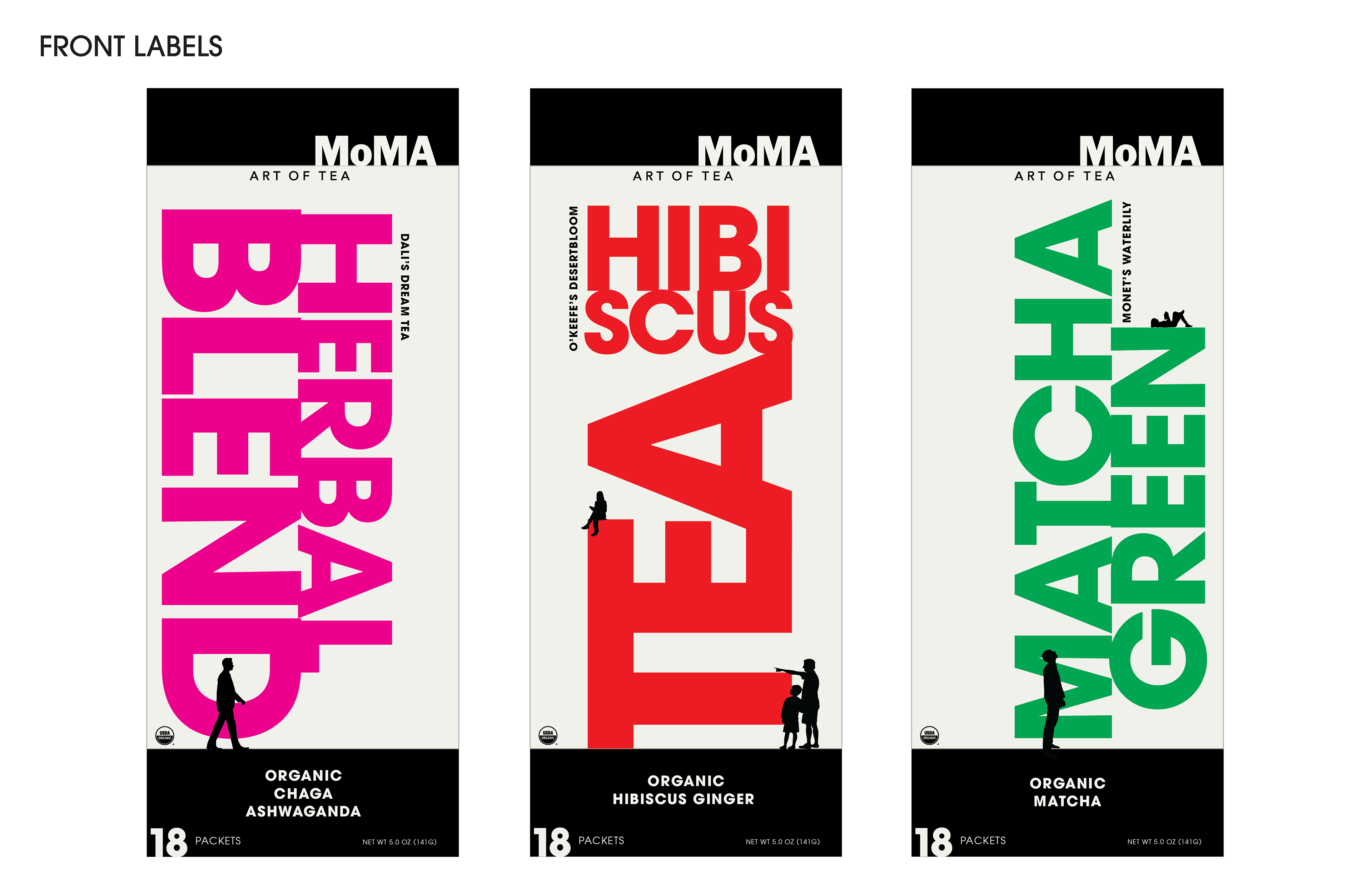
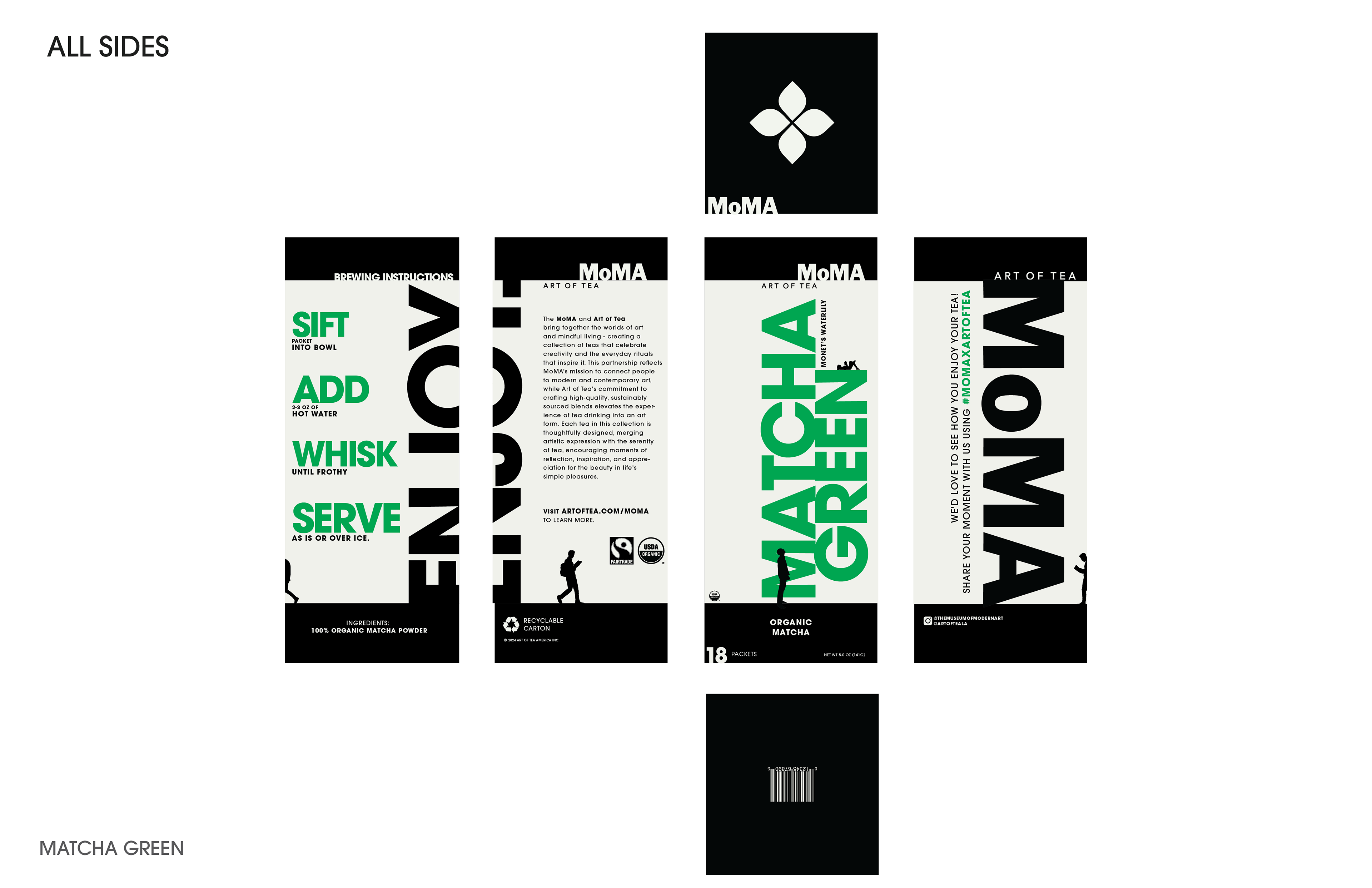
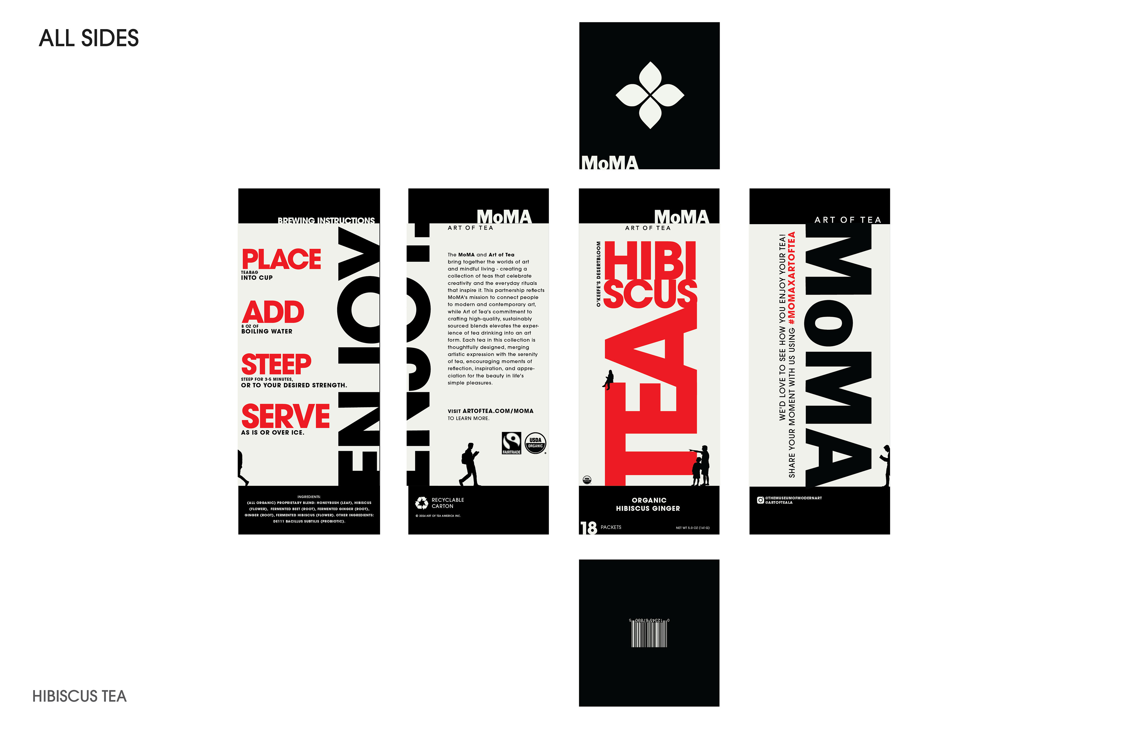
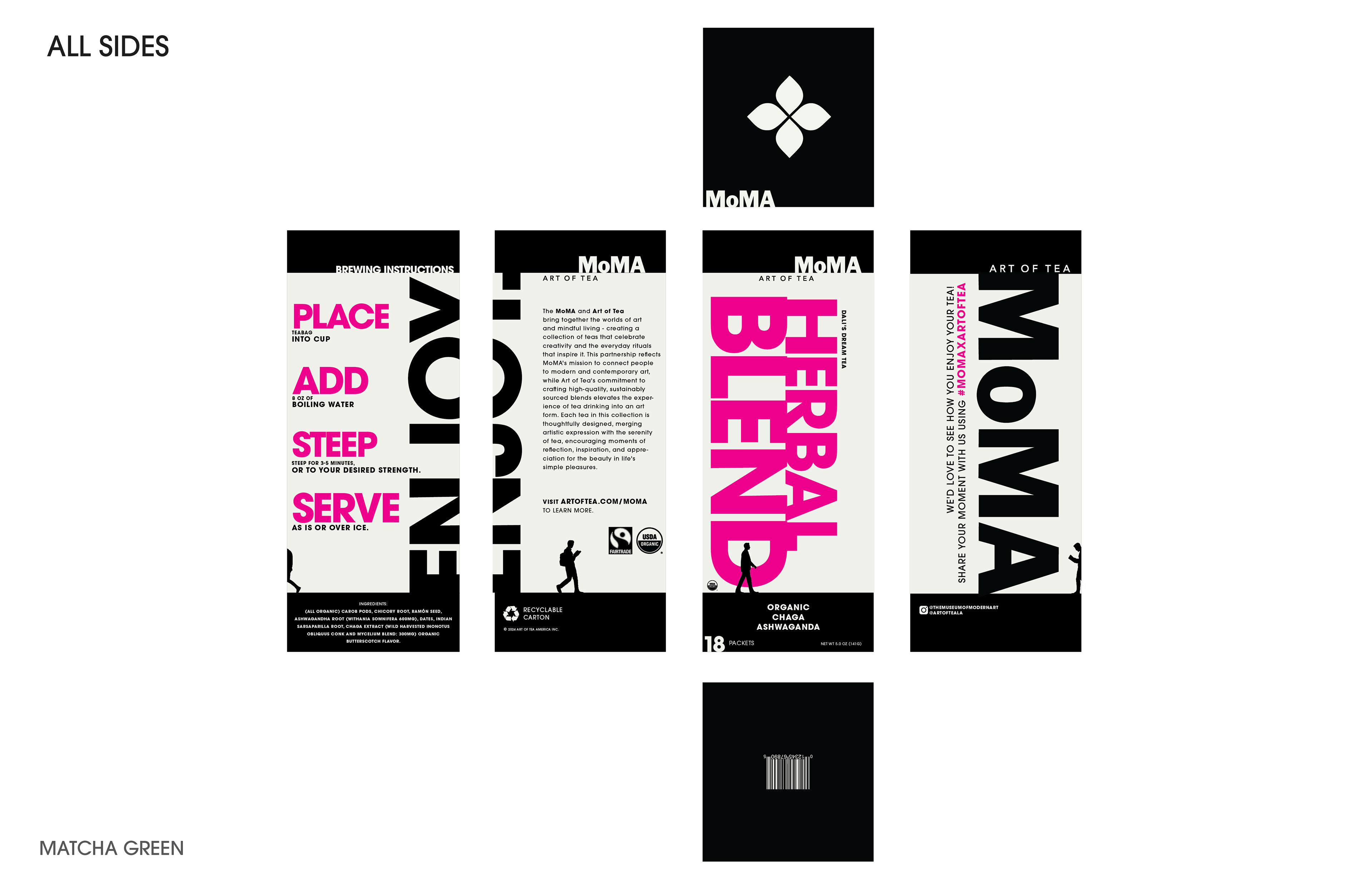
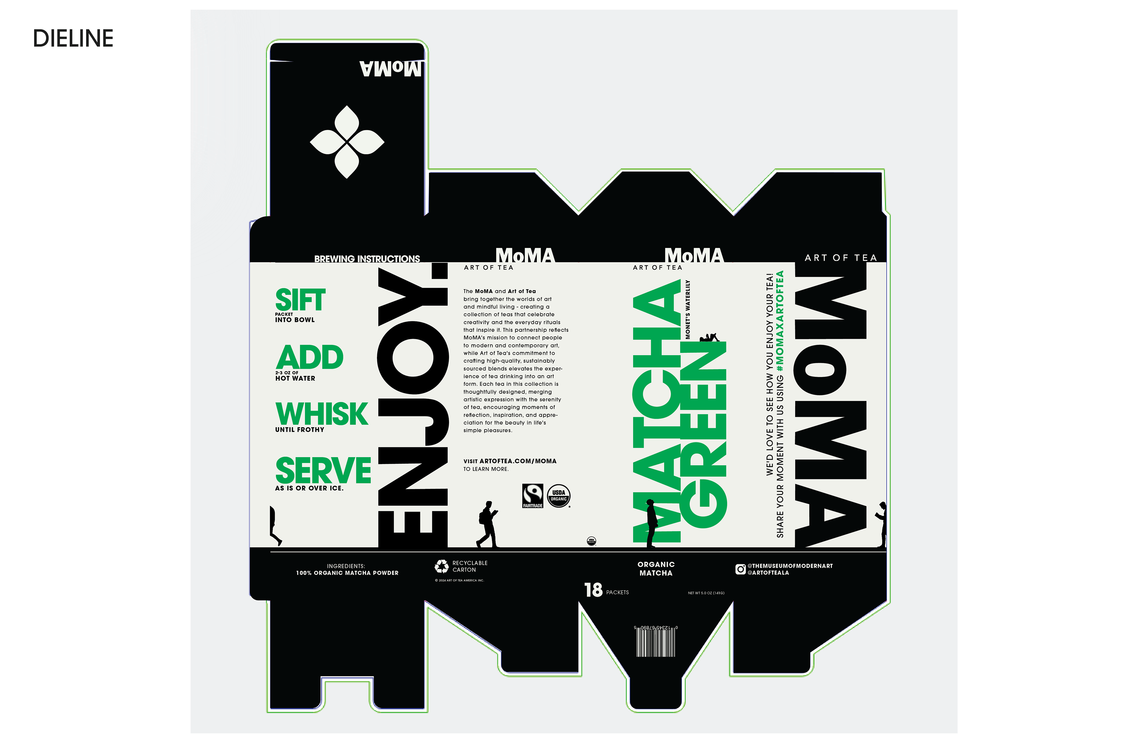
This concept project reimagines tea packaging through the lens of museum design—treating each box like a small exhibition space. The typography takes the center stage, not just as text but as a living sculpture that shapes the identity of each flavor. Words like HIBISCUS and MATCHA GREEN stack and occupy the surface with intention, becoming part of a seemingly interactive and larger visual architecture. Small human figures are placed throughout the layout, observing and interacting with the type as if it were on display in a gallery. This creates a playful tension between scale and meaning—the packaging becomes both product and artwork, something to look at as much as to use. The concept ties back to MoMA’s mission of bringing art into everyday life, where even a simple tea box can invite curiosity and play.
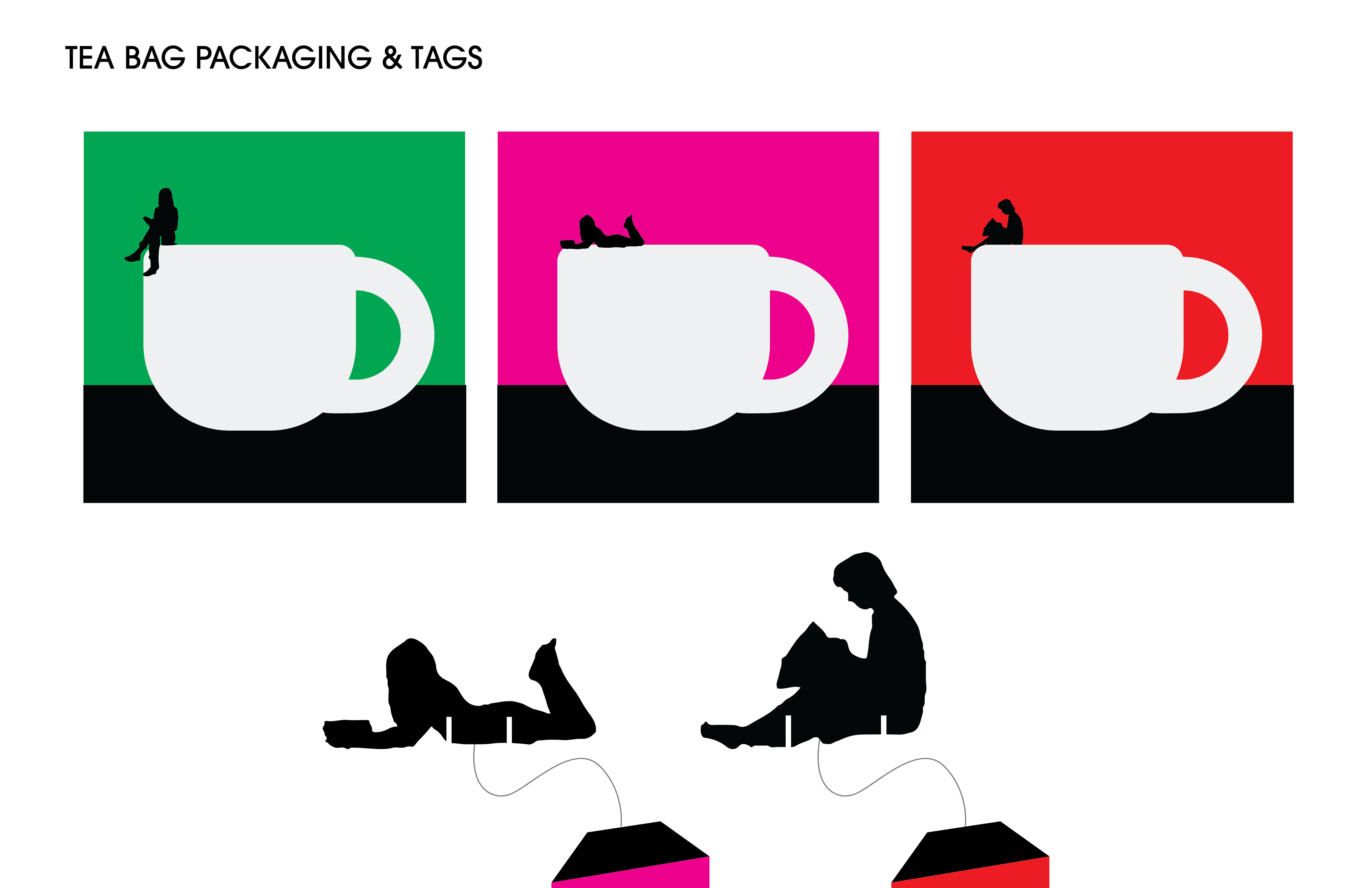
The teabags and tags expand on the idea by turning the tea bags into little scenes of rest and reflection. Each tea tag can connect to a large cup above it: where small figures sit, lounge, or read on the edge of a real cup. It’s a playful way of showing how something as simple as making tea can feel like taking a moment for yourself—quiet, thoughtful, and a bit like experiencing art in everyday life.