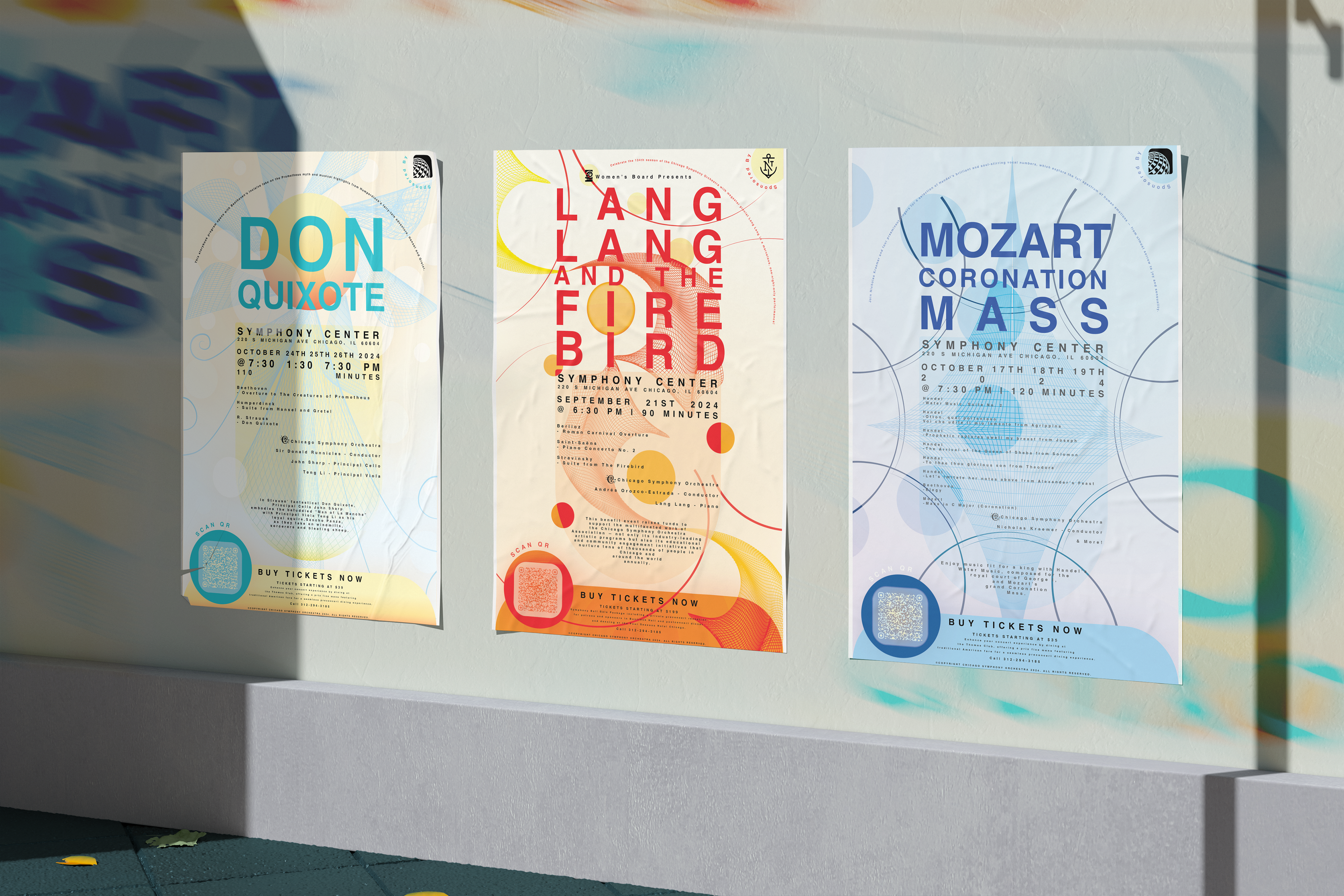
CHICAGO SYMPHONY CENTER | POSTER SERIES
Don Quixote · Lang Lang and The Firebird · Mozart Coronation Mass
The Problem
Classical music is inherently emotional and dynamic, yet traditional concert posters often rely on literal imagery or standardized layouts that fail to capture the feeling, rhythm, and energy of the performance. This creates a disconnect between the experience of the music and how it is visually communicated.
The Solution
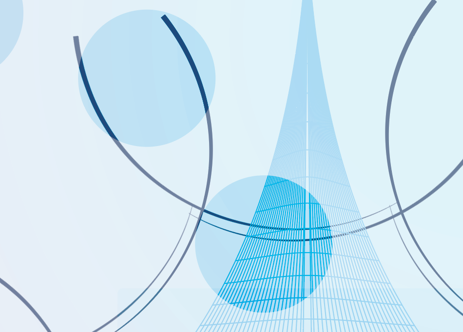
Chicago Symphony Center Poster Series translates music into a visual language by focusing on rhythm, tone, and movement rather than literal representation. Each poster draws from the structure and emotion of its featured piece—using color, form, and typography to echo how the music feels. Through layered compositions, shifting scale, and dynamic systems, the series functions as a set of visual performances—distinct yet unified, capturing both the individuality of each piece and their place within a larger orchestral system.
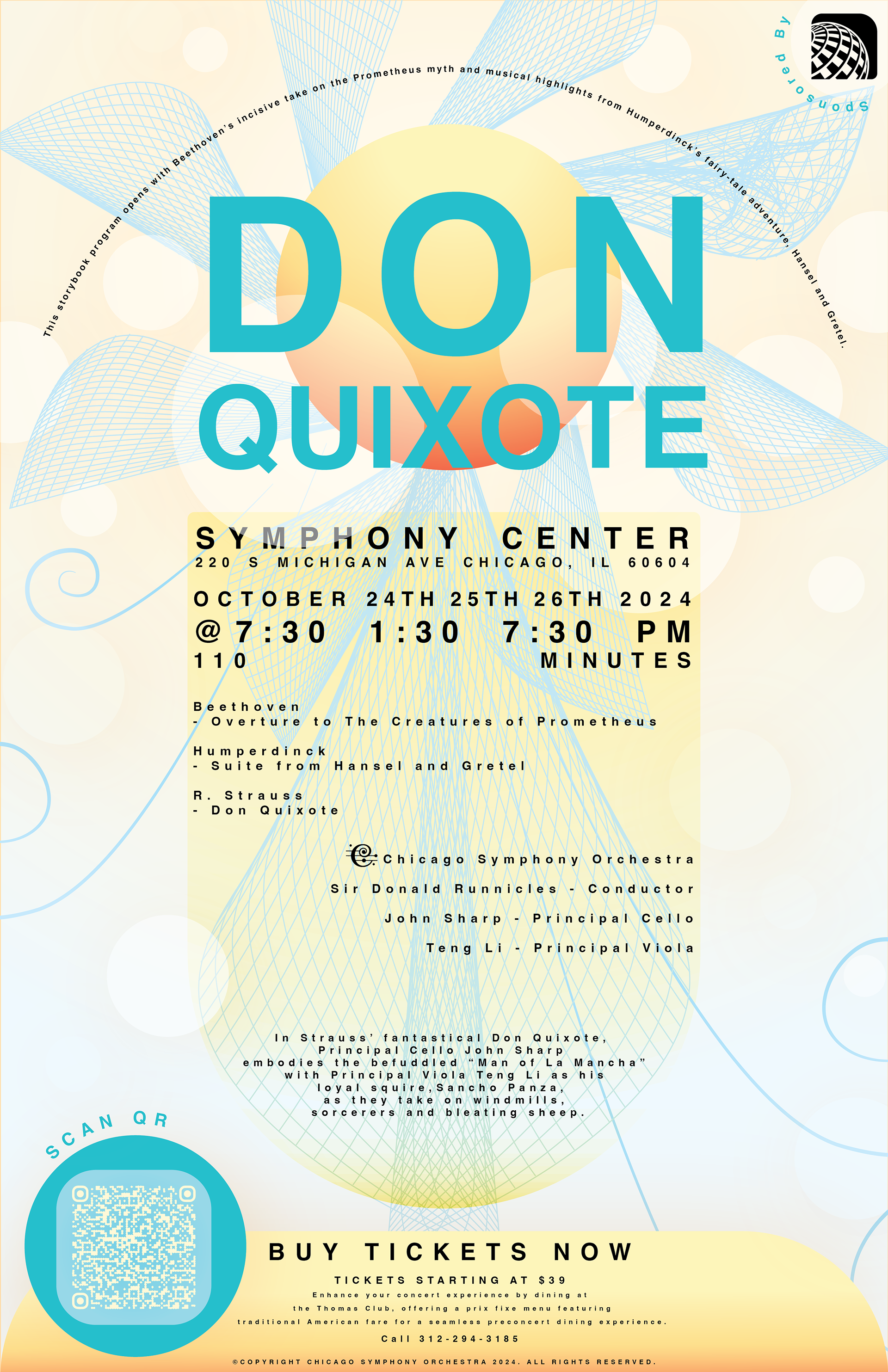
This project explores how music can be translated into visual rhythm using abstracted form. Each poster takes cues from the tone and structure of its featured piece—using color, form, and typography to echo what the music feels like rather than what it literally is.
I treated each design like a visual performance: layering geometric shapes, gradients, and grids to create a sense of motion and harmony. The type plays a big role—it shifts in scale and weight to mimic the tempo and dynamics of the music.
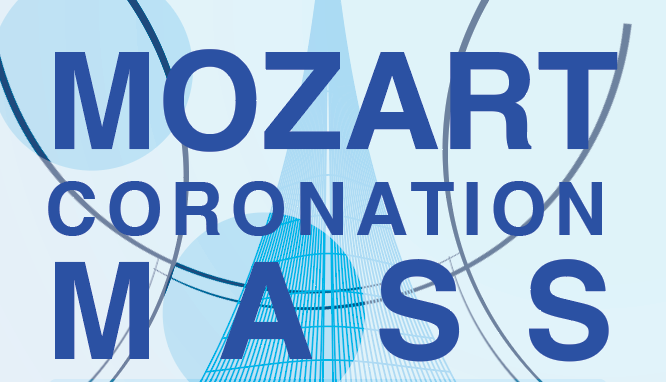
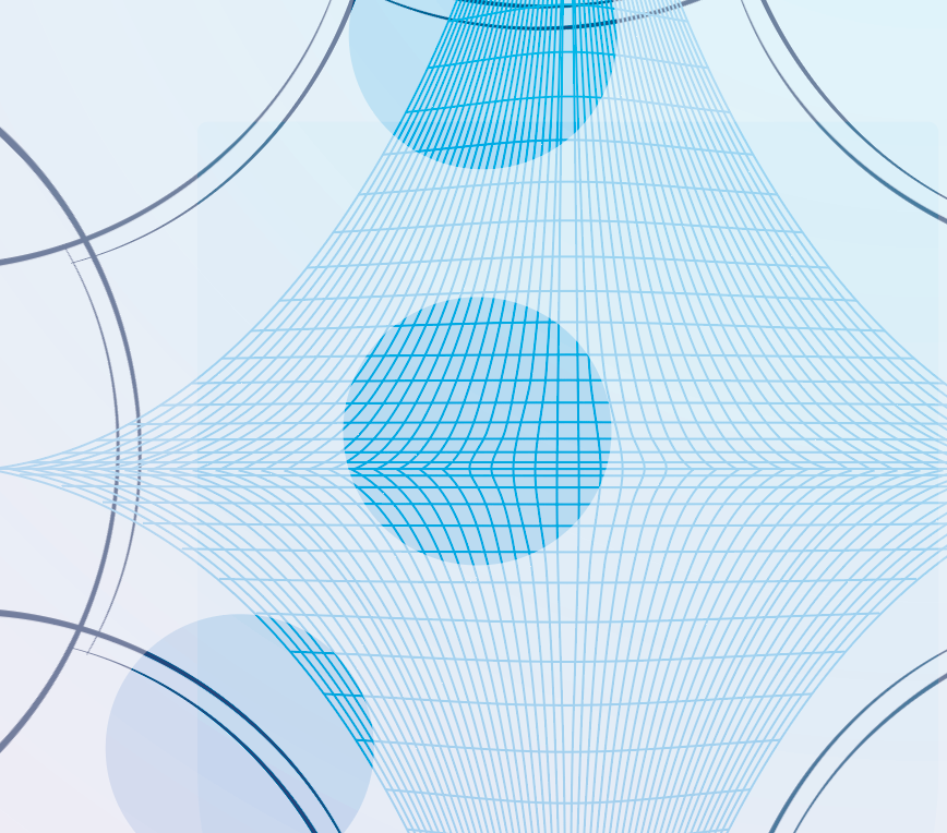
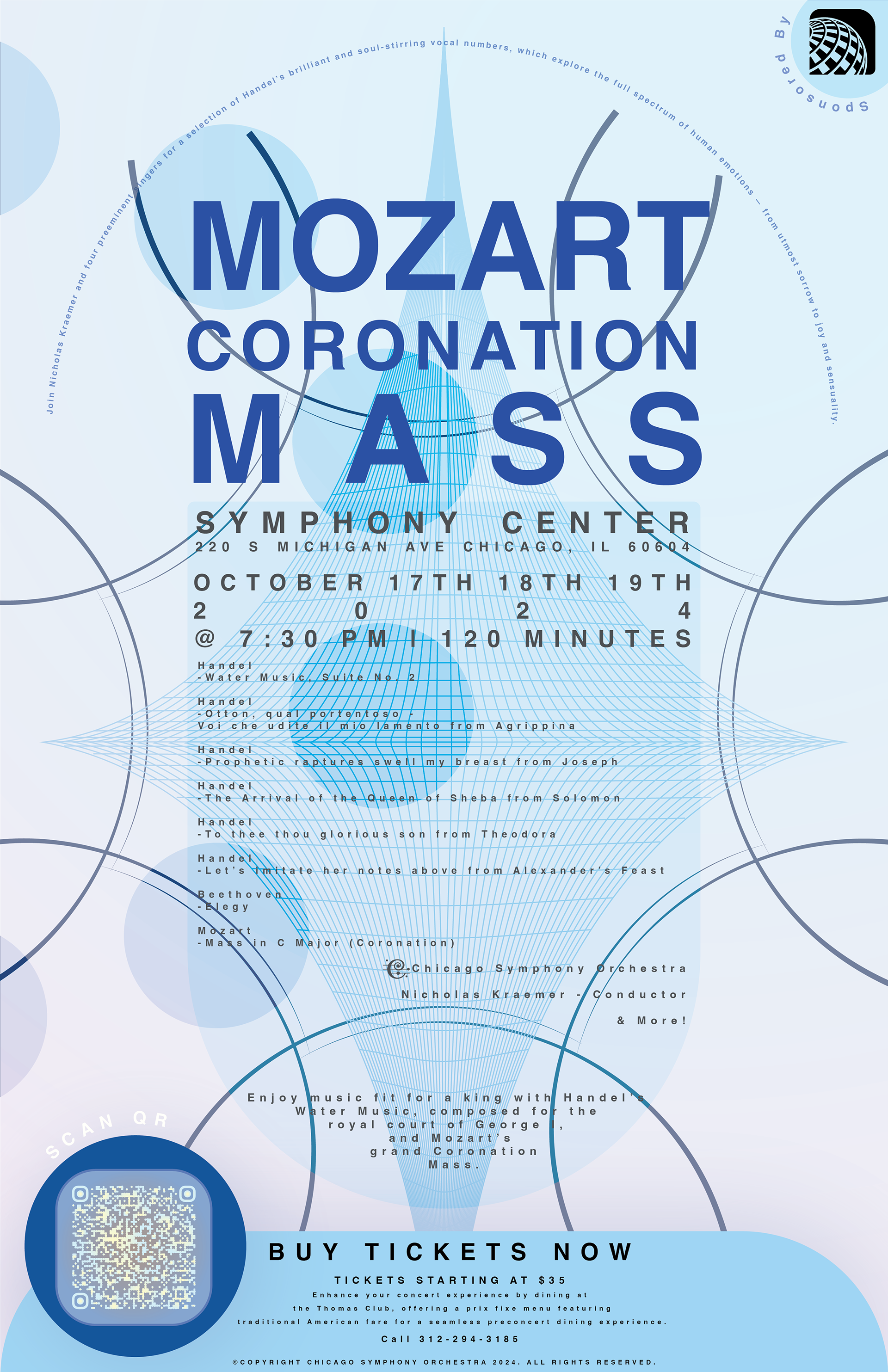
Mozart Coronation Mass feels calm and regal, built around symmetry and cool blues.
Don Quixote is warmer and more fluid, full of circular movement and sunlight tones.
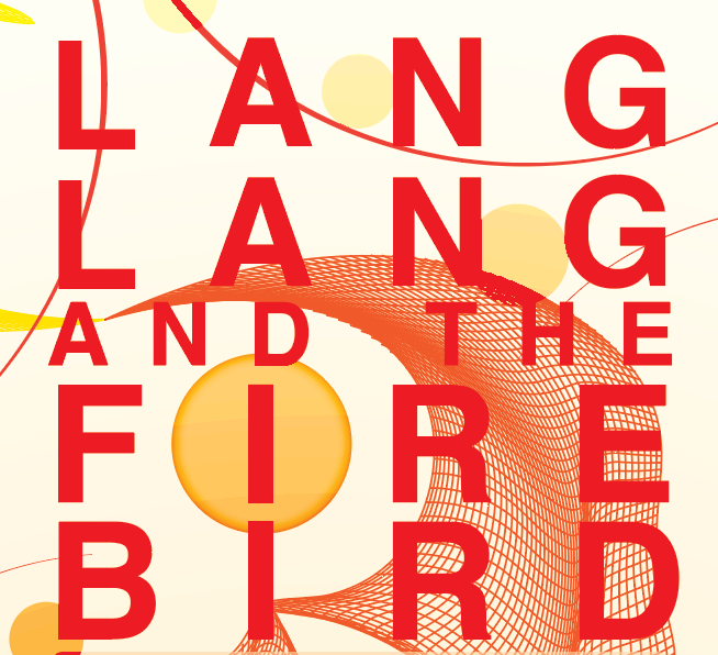
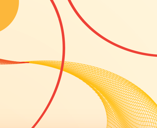
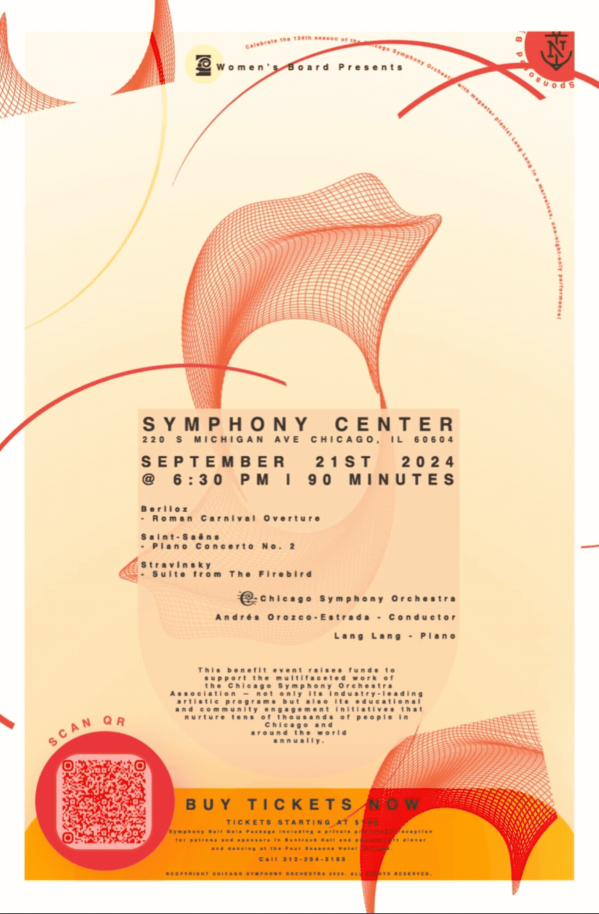
Lang Lang and The Firebird bursts with contrast and energy, using red and gold to capture its fiery intensity.
Together, they form a connected visual system that balances structure and emotion—each one distinct, but still part of the same orchestral “family.”