Christian Schaible's
Fine Art Portfolio.
Introduction:
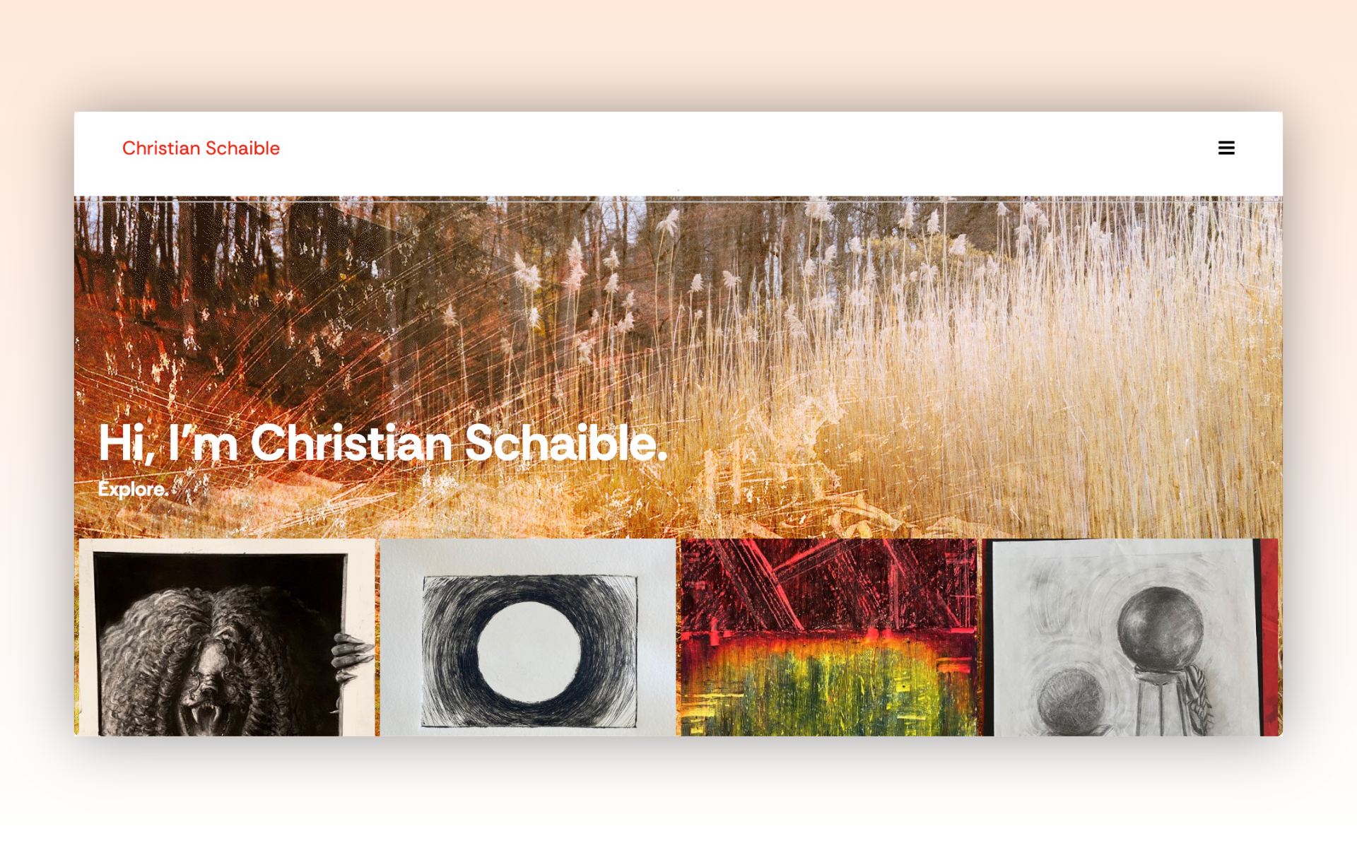
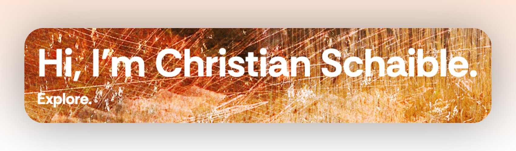
This website is a dedicated portfolio for my personal fine art practice. It serves as a curated space to show my art, rather than relying on social media posts. This site centralizes my work in one professional, yet visually engaging location! By creating this site, I hope to create opportunities: whether it's sourcing commissions, applying for exhibitions, or simply just having my own personal archive.
Personas:
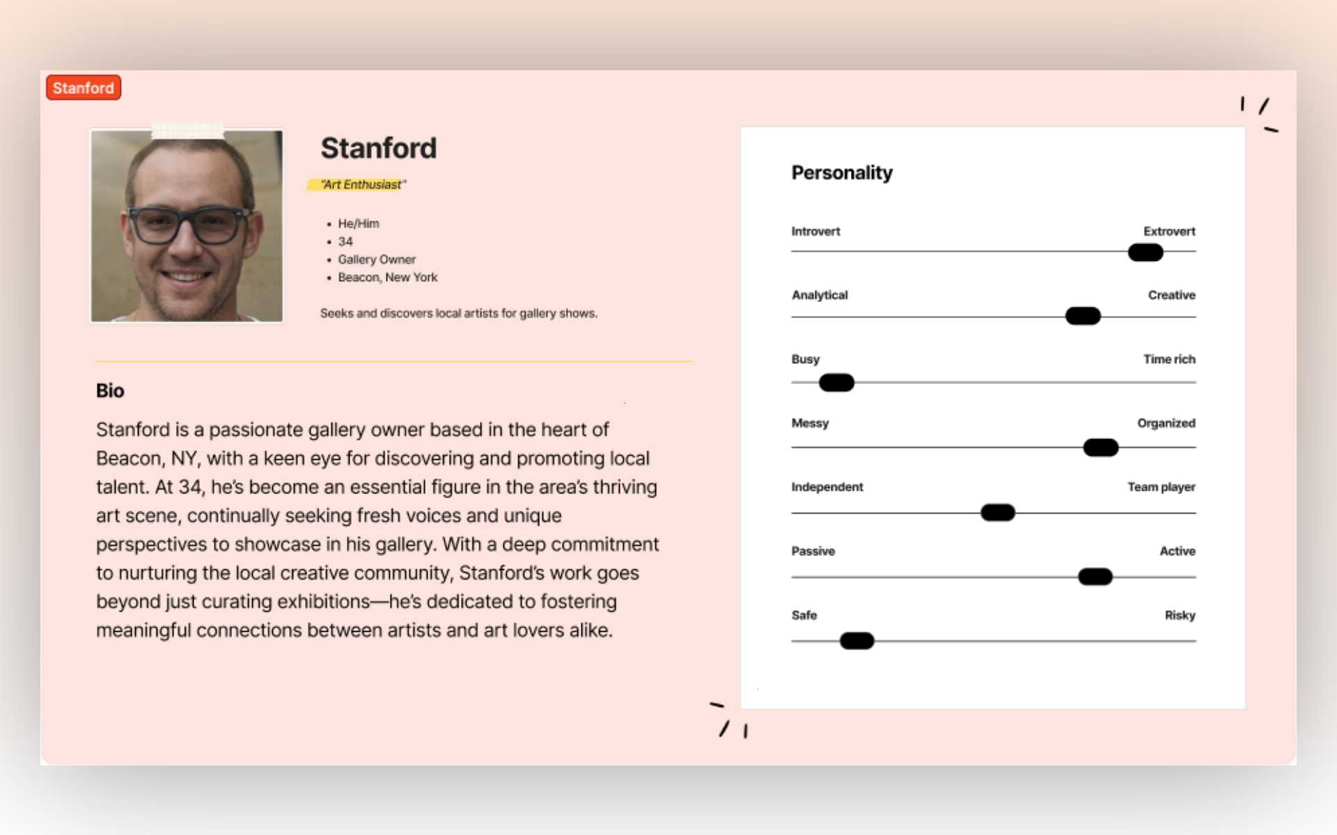
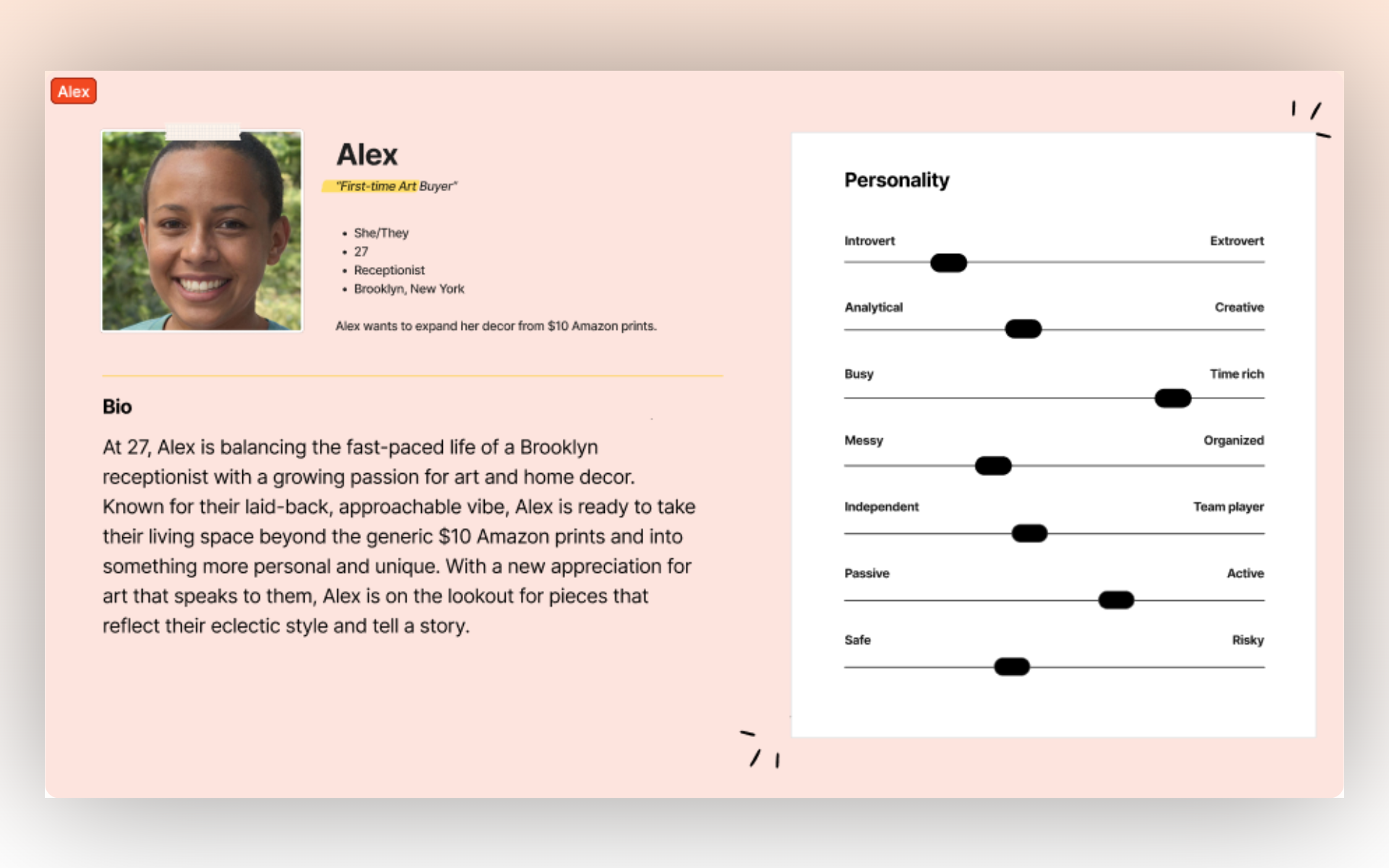
My personas represent individuals who are looking to view my work / art in general, and those who seek to engage with, potentially hire, or collaborate with myself. These users require intuitive navigation, accessible content, and a clear view of my art and capabilities. These personas have helped me define the overall tone of the site, the kind of content to include, and how I should prioritize it.
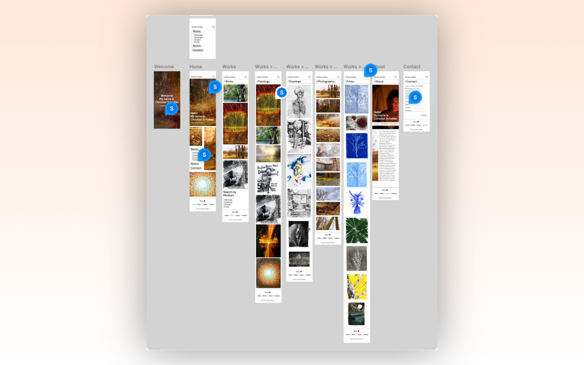
Site Map:
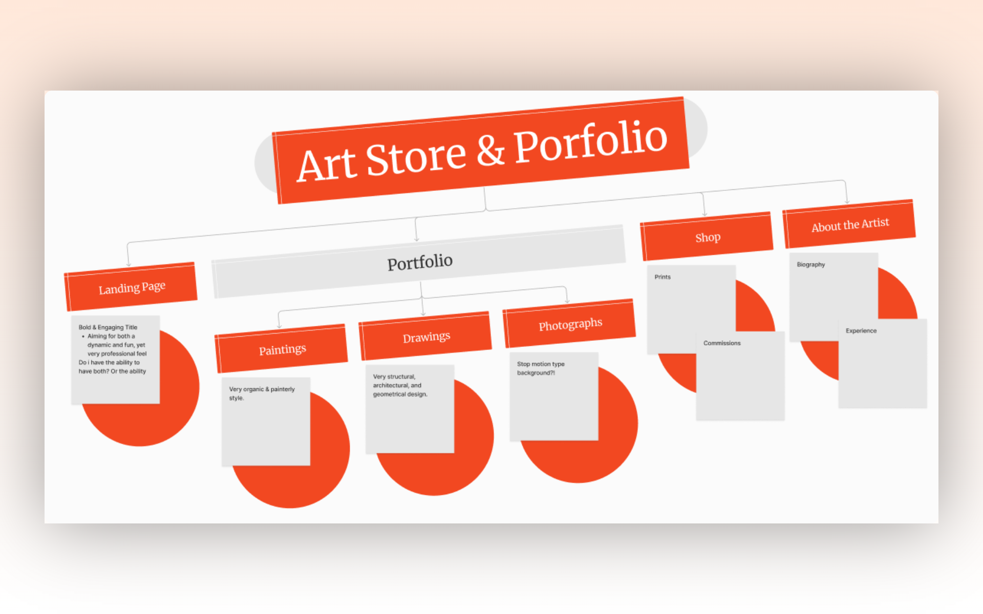
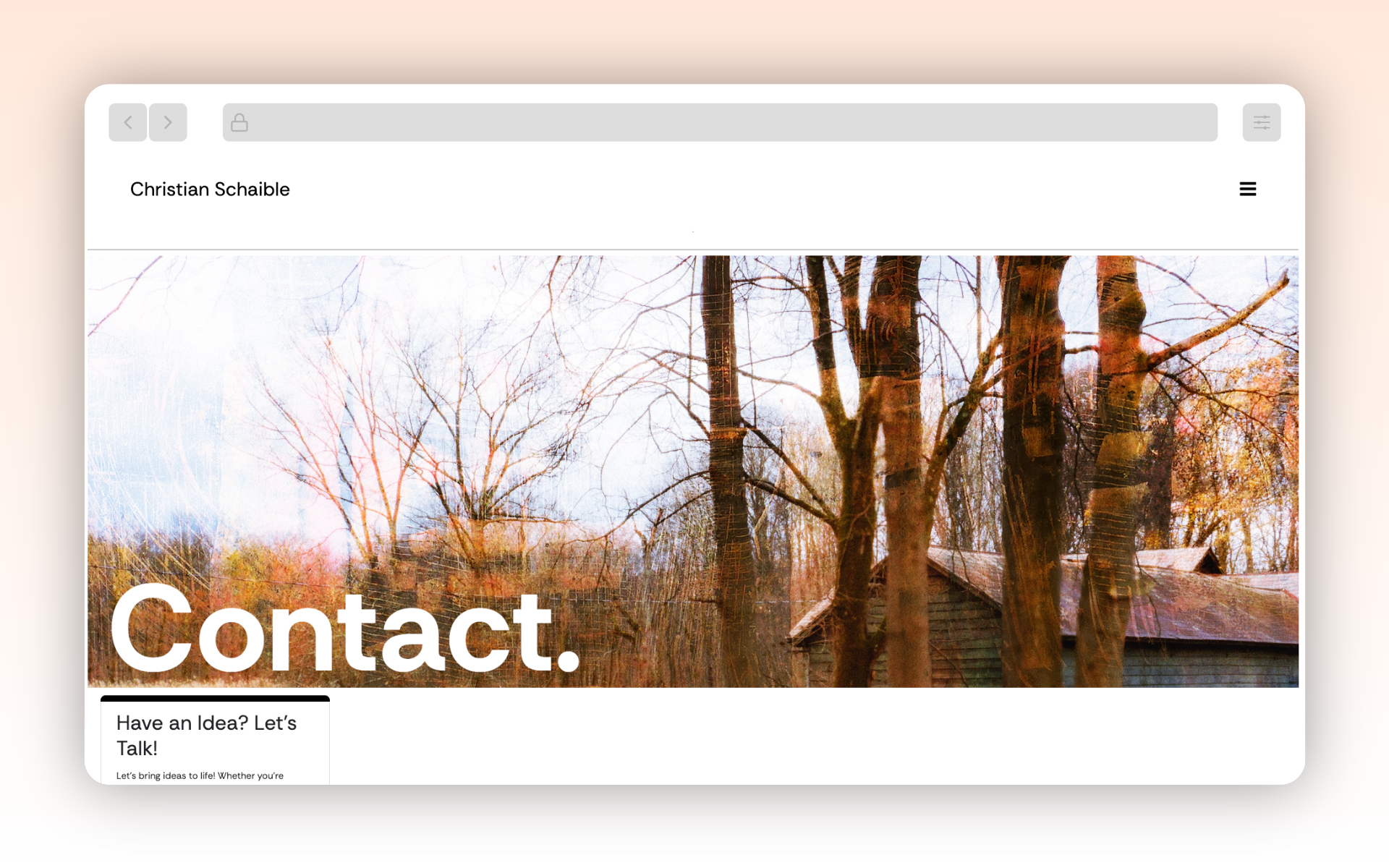
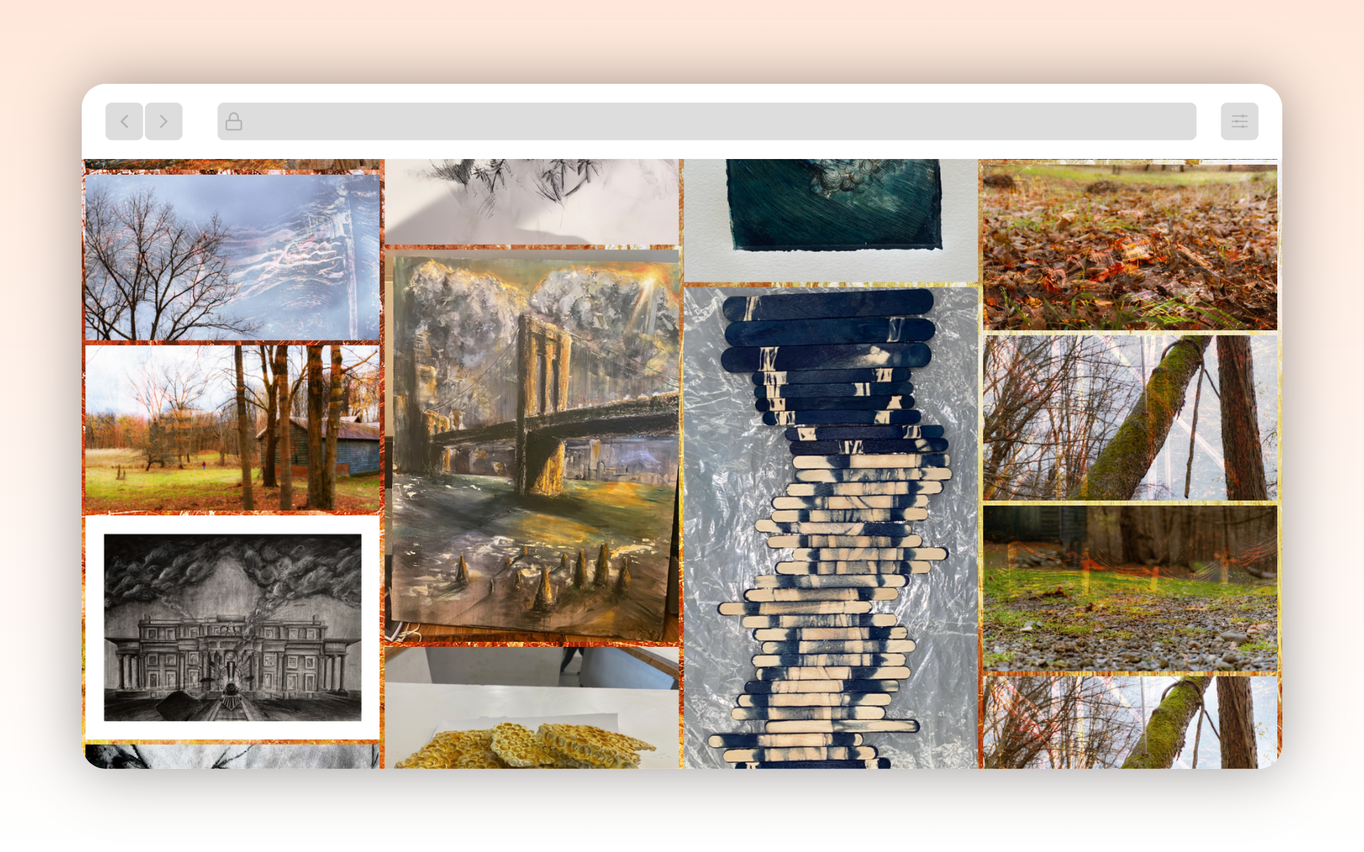
The mapping process helped me understand which pages needed to exist and what kind of blocks of content would be necessary for each. My personas have been reflected through easy sources of communication, an about me page (to further understand who I am as an artist), and an easy view of all my works.
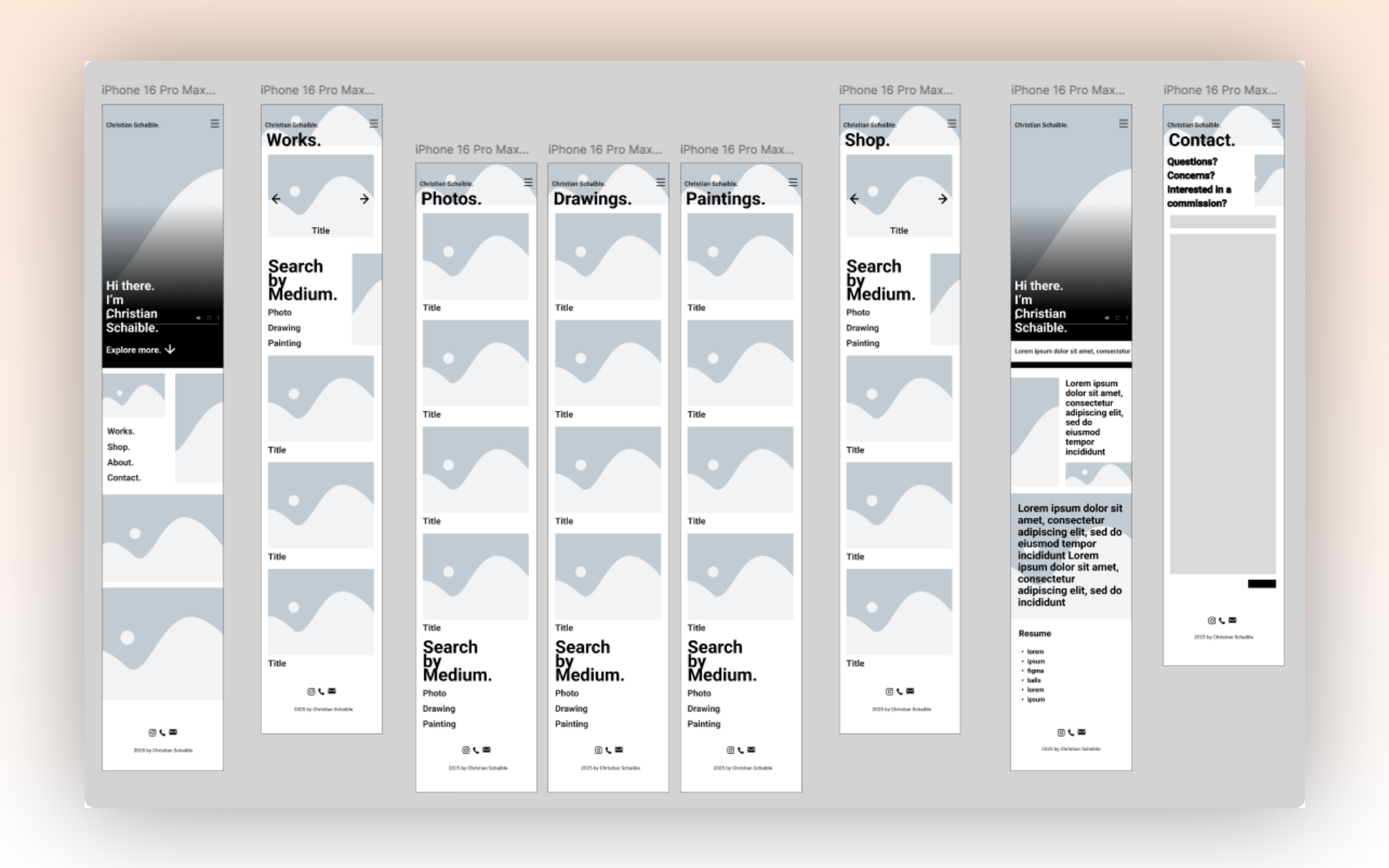
Wireframes:
The wireframes showed me how the content had to relate to a visual layout/system. Once the beginning content and type was placed, it became far easier to see what I was actually creating. Even without color or image, the site started to feel alive. This process allowed for consistency, which ultimately flowed and followed into the later parts of the process.
Mockups/Prototype:
Using Figma, mockups were created from the wireframes and turned into an interactive prototype (with image and color). This part of the process highlighted some issues, like the implementation of a shop. Testing on different screen sizes led to alterations in button sizings, text alignment, and what needed to be interactive or not. Accessibility features like color contrast and legibility were definitely improved once able to view on a mobile device.
Development:
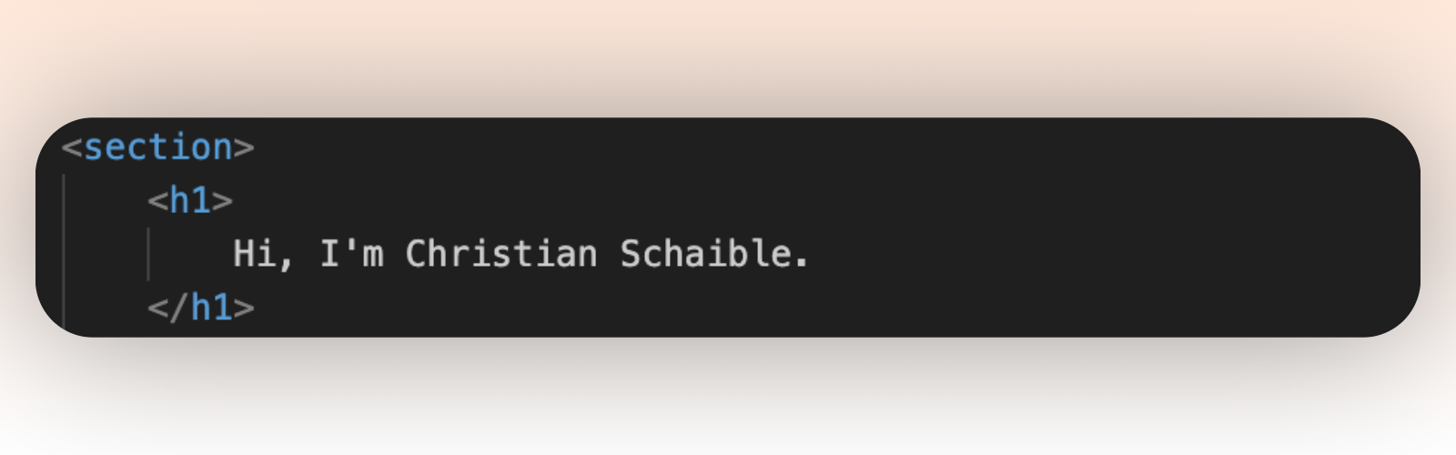
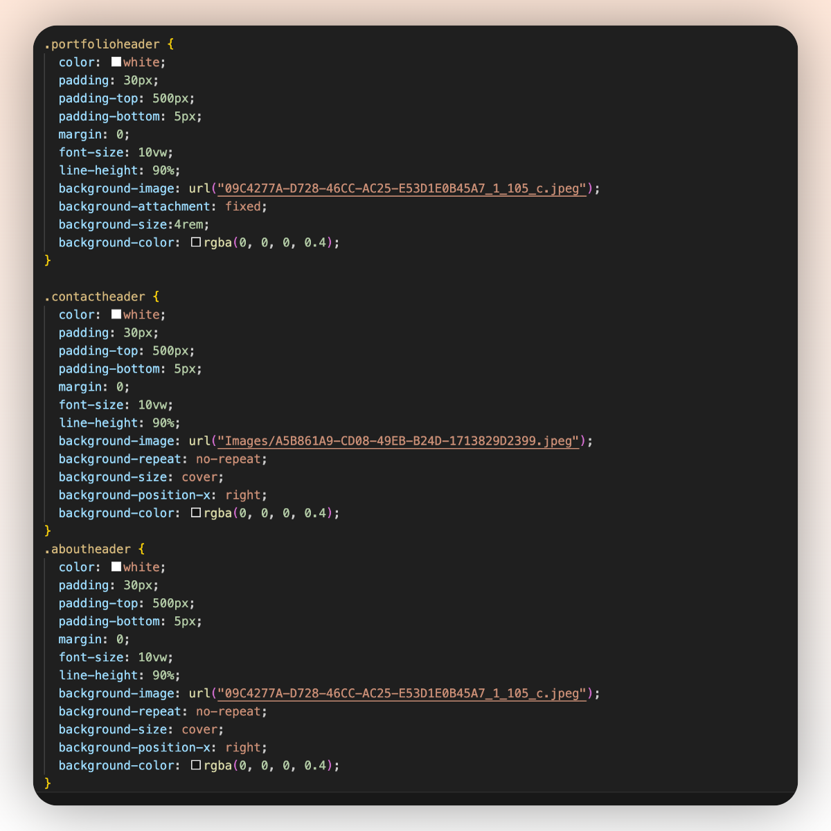
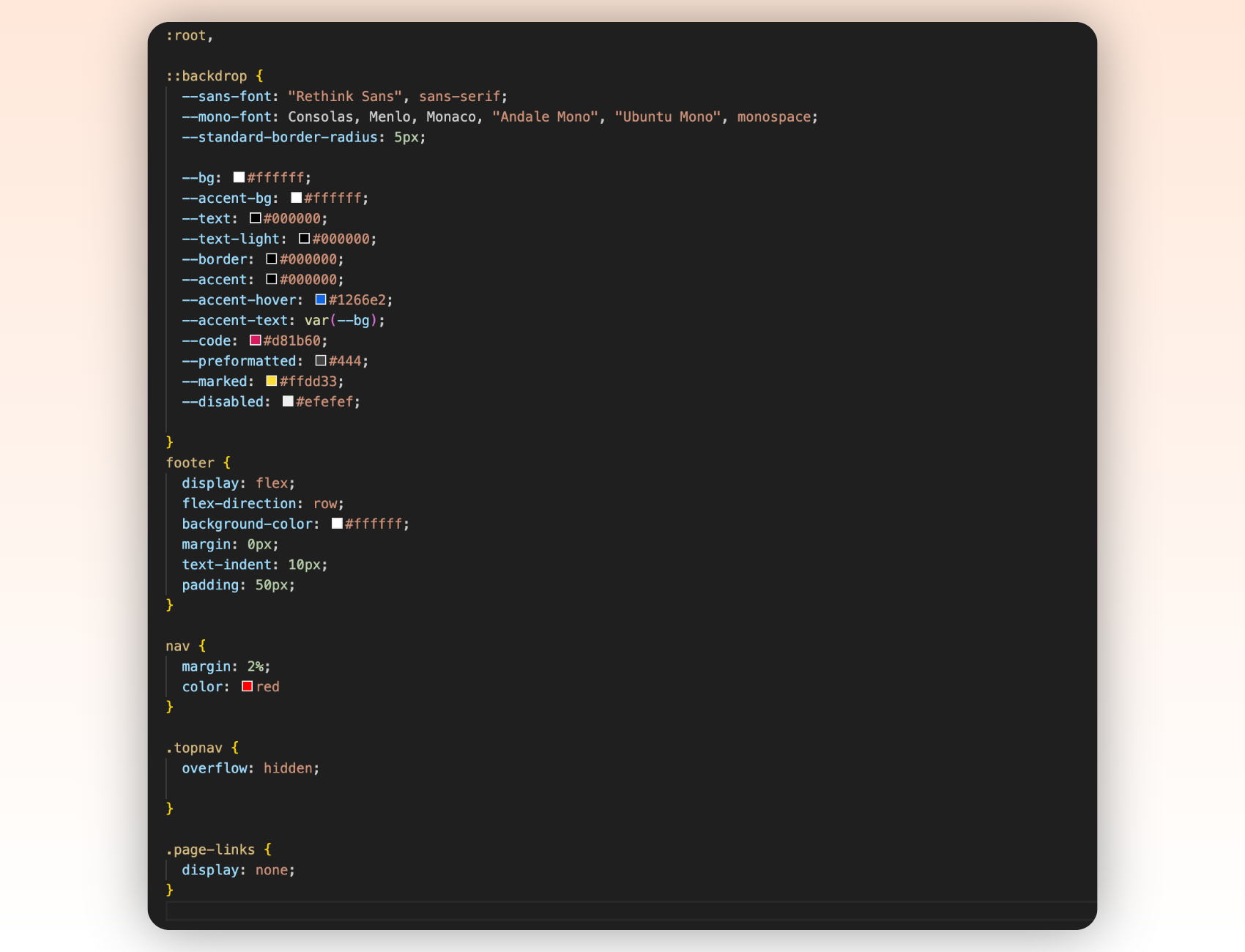
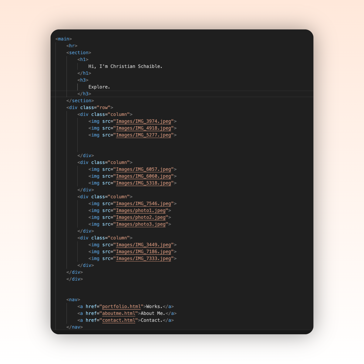
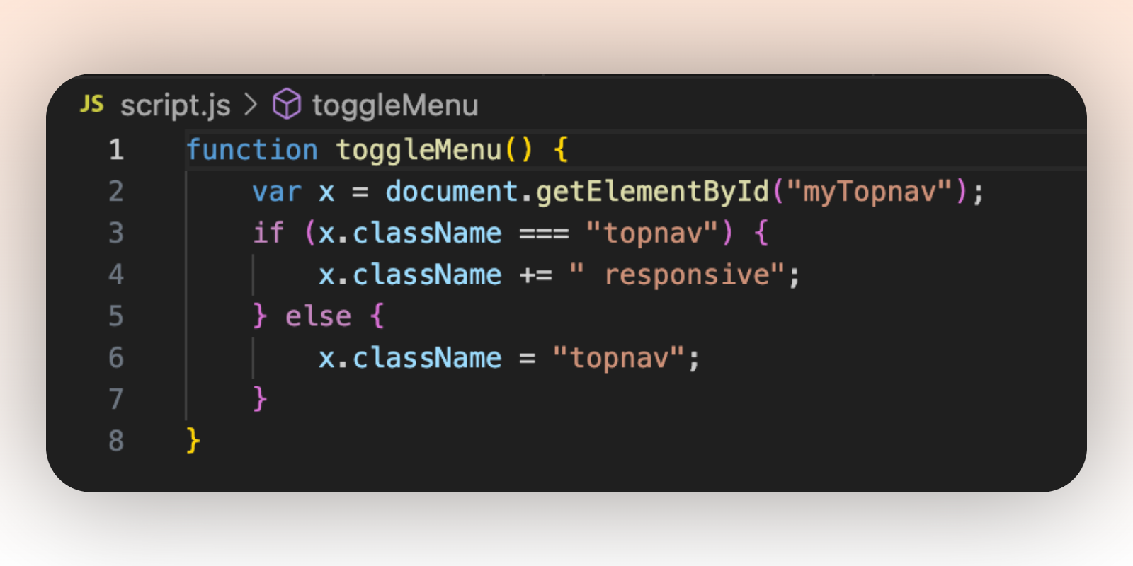
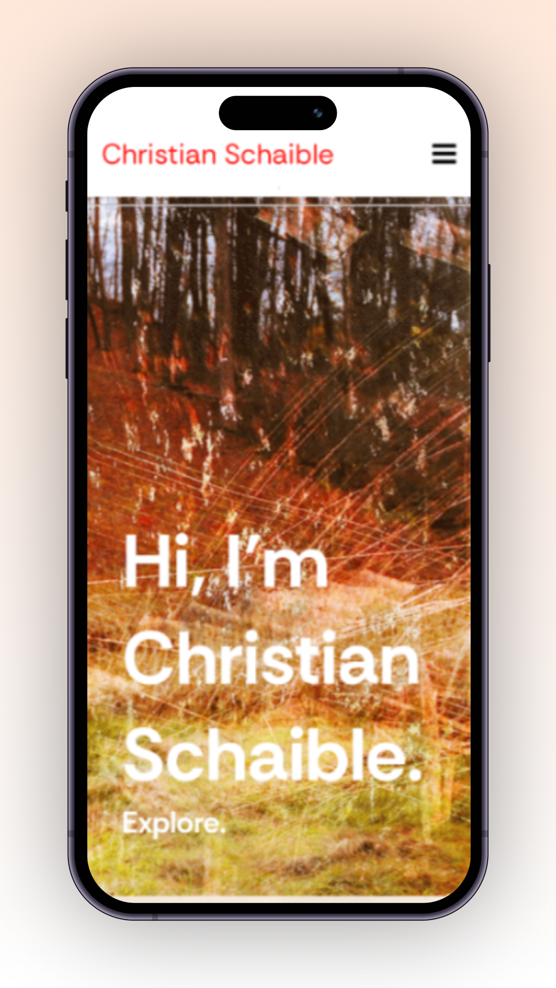
I really enjoyed the process of building out my designs, especially by using CSS to bring the layout and style to life! Once I had created the design in Figma, turning it into a functional and responsive site felt extremely rewarding. I spent a lot of time researching and experimenting with different approaches to styling, responsiveness, and accessibility. I often turned to forums and tutorials to problem-solve and implement details that made a big difference (like the responsive image grid!). I often used semantic HTML elements like the header, footer, main, nav, and section. By running accessibility tests, it led me to make changes like improving color contrast, and optimizing text/image sizes across all devices.
Final Deliverable.

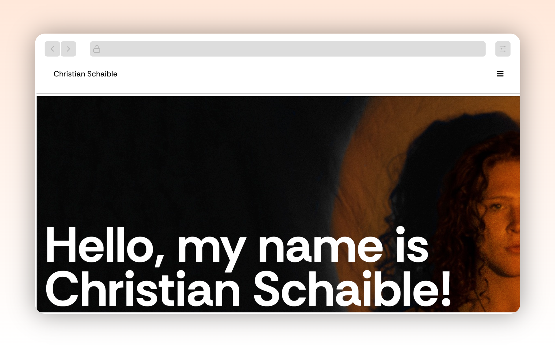
Final website: https://cschaible.netlify.app/
Spring 2025